This is the first of what will likely be a two part project exploring themes surrounding Harry Browne’s Permanent Portfolio. Part I will cover the fundamentals of economic regimes and their asset returns. Part II and beyond will explore hypothetical portfolio construction and implementation.
Financial Topics Covered
- Defining economic growth and inflation regimes
- Historical asset performance
- Arithmetic vs. Geometric return
Technical Skills Covered
- Pandas: groupby, rolling functions
- Itertools: combinations
- Scipy: Two sample T-test
WTF is the Permanent Portfolio?
While the idea of structuring one’s affairs to build wealth through all economic climates dates back much further, it was popularized in modern times by the work of Harry Browne in the 1970’s.
The basic premise of the Permanent Portfolio is simple — construct a portfolio that can perform regardless of the economic climate. Growth, Recession, Inflation, Disinflation/deflation, the idea is that it’s always a favorable environment for something. His original implementation was:
- 25% Stocks (Growth)
- 25% Treasury Bonds (Disinflation/Recession)
- 25% Gold (Inflation)
- 25% Cash (Recession/disinflation)
It’s designed to be conservative, hard to kill, and preserve/compound wealth steadily across long time horizons and full economic cycles.
The goal of this exercise is to create a framework for analyzing and comparing different assets across economic regimes. This will open the door to answering questions like:
Is gold the most effective exposure for inflationary periods?
Which sectors of the equity market tend to outperform in periods of low or negative growth?
If you’re interested in learning more about the Permanent Portfolio, Browne wrote a number of books, like this one. It also comes up with some regularity in perhaps the most entertaining high finance podcast out there, Pirates of Finance (one of the hosts runs an investment product that is a modern extension/implementation of the PP). The goal here is to simply give a baseline level of context as a backdrop for the work we’ll do.
As they say, a spoonful of context helps the code go down…
Our first step today will be to define our economic regimes and create an efficient tool for assessing which asset classes have performed best in each regime historically.
Step 1: Defining Economic Regimes
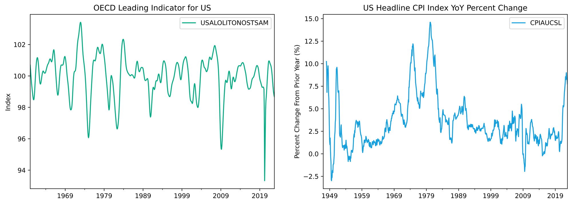
To map our economic regimes, we’re going to need growth and inflation data.
For inflation, we’ll keep it simple and use Headline CPI (the volatility of the food and energy components are features, not bugs, for our purposes). It also has the benefit of being reasonably high frequency (monthly).
Growth will require more Nuance. Real Gross Domestic Product is fine, but is only released quarterly and often subject to major revisions. To match the frequency of our CPI data we can use the OECD Leading Indicator for the US as our growth proxy.
Specifically, we’re going to use the 3-month difference in the year-over-year growth rates (the trusty second derivative) so we can define the regimes by the acceleration and deceleration of growth and inflation. The reason for this is that economic activity is constantly ebbing and flowing, and financial markets are constantly reacting to changes in expectations about the future. It’s the rate of change that matters.
We want to map historical periods into one of four buckets:
- Growth accelerating📈, Inflation accelerating 📈 (moon)
- Growth accelerating📈, Inflation decelerating📉 (still gucci)
- Growth decelerating📉, Inflation accelerating📈 (it’s fine. we’re fine. i’m fine.)
- Growth decelerating 📉, Inflation decelerating📉 (lol rekt.)
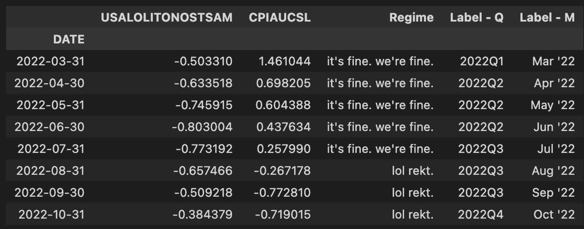
Guess which regime we are currently in… yup 📉,📉... rekt!
Let’s Get to the Code
Similar to our foray into total return and bond yields, we can tap both of these datasets directly from FRED via pandas datareader.
We’ll start with what have become a few standard imports around these parts.
import pandas as pd
import numpy as np
import pandas_datareader as pdr
import matplotlib.pyplot as plt
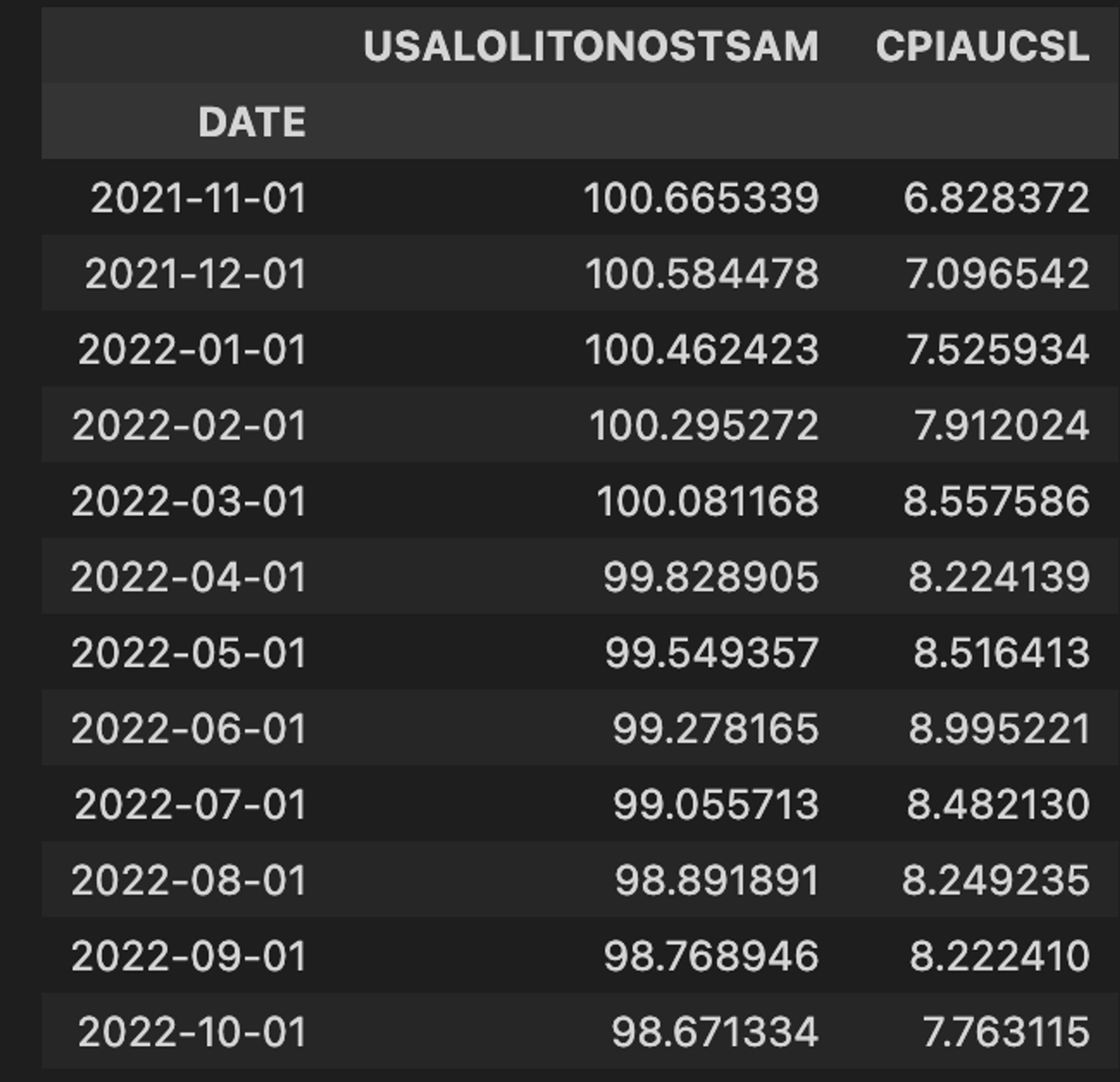
The first order of business is to pull in our growth and inflation data. The Headline CPI comes in as an index value, so we’ll need to convert this to a percentage change from the prior year. The OECD Leading Indicator is a diffusion index and already reflects prior period changes, so it requires no additional processing at this step.
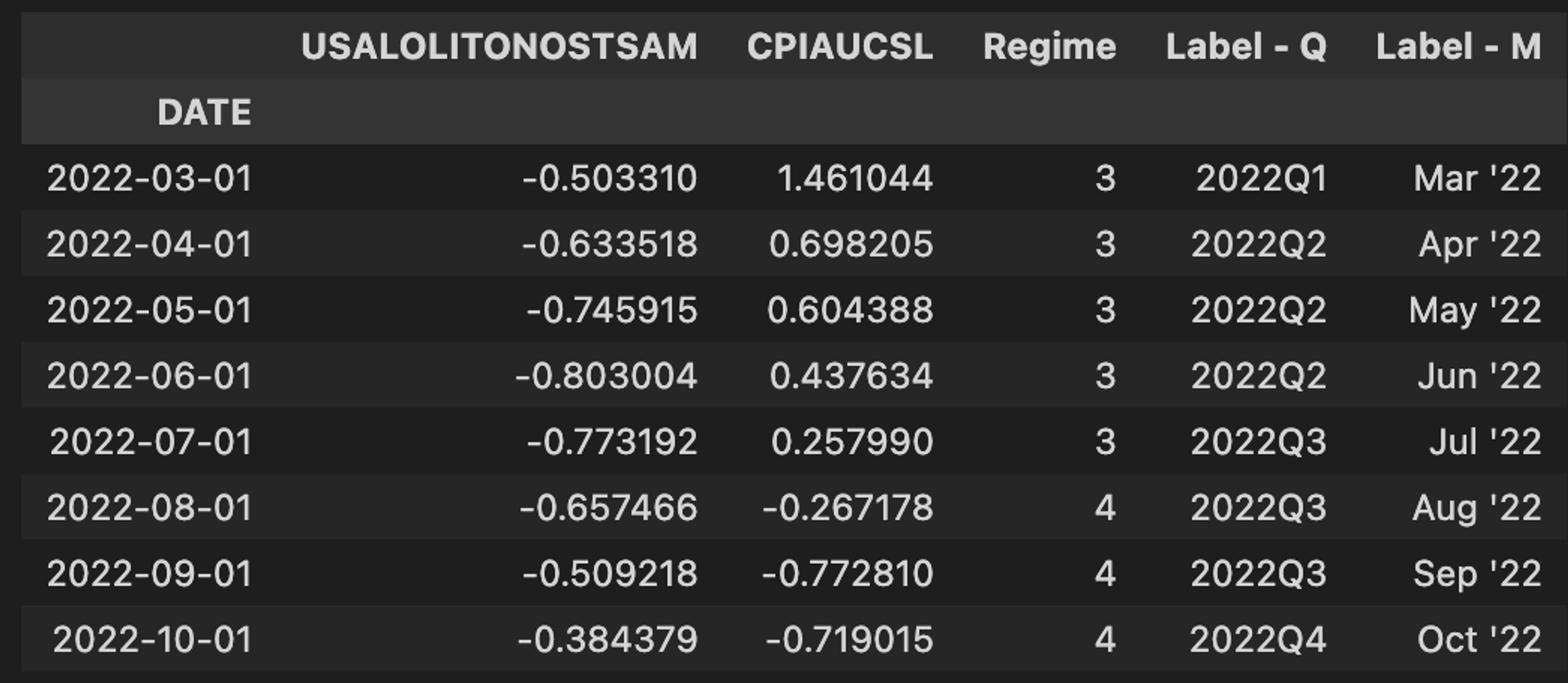
cli = 'USALOLITONOSTSAM'
cpi = 'CPIAUCSL'

g = pdr.DataReader(cli, 'fred', '1900-01-01')
i = pdr.DataReader(cpi, 'fred', '1900-01-01')
i = i.pct_change(12) * 100
Let’s take a quick look at our inputs.
fig, (ax1, ax2) = plt.subplots(1, 2, figsize=(15, 5), facecolor="white")

g.plot(ax=ax1, color=COLORS[0])
ax1.set(title="OECD Leading Indicator for US", ylabel="Index", xlabel="")

i.plot(ax=ax2, color=COLORS[2])
ax2.set(
    title="US Headline CPI Index YoY Percent Change",
    ylabel="Percent Change From Prior Year (%)",
    xlabel=""
)
We’ll combine both into one DataFrame so we can lean on pandas’ super convenient suite of built-in methods to do most of our work.
gi = pd.concat([g, i], axis=1).dropna()
Next, we’ll take our 3 month difference. This is the rate-of-change data we’ll use to map our regimes.
gi3 = (gi - gi.shift(3)).dropna()
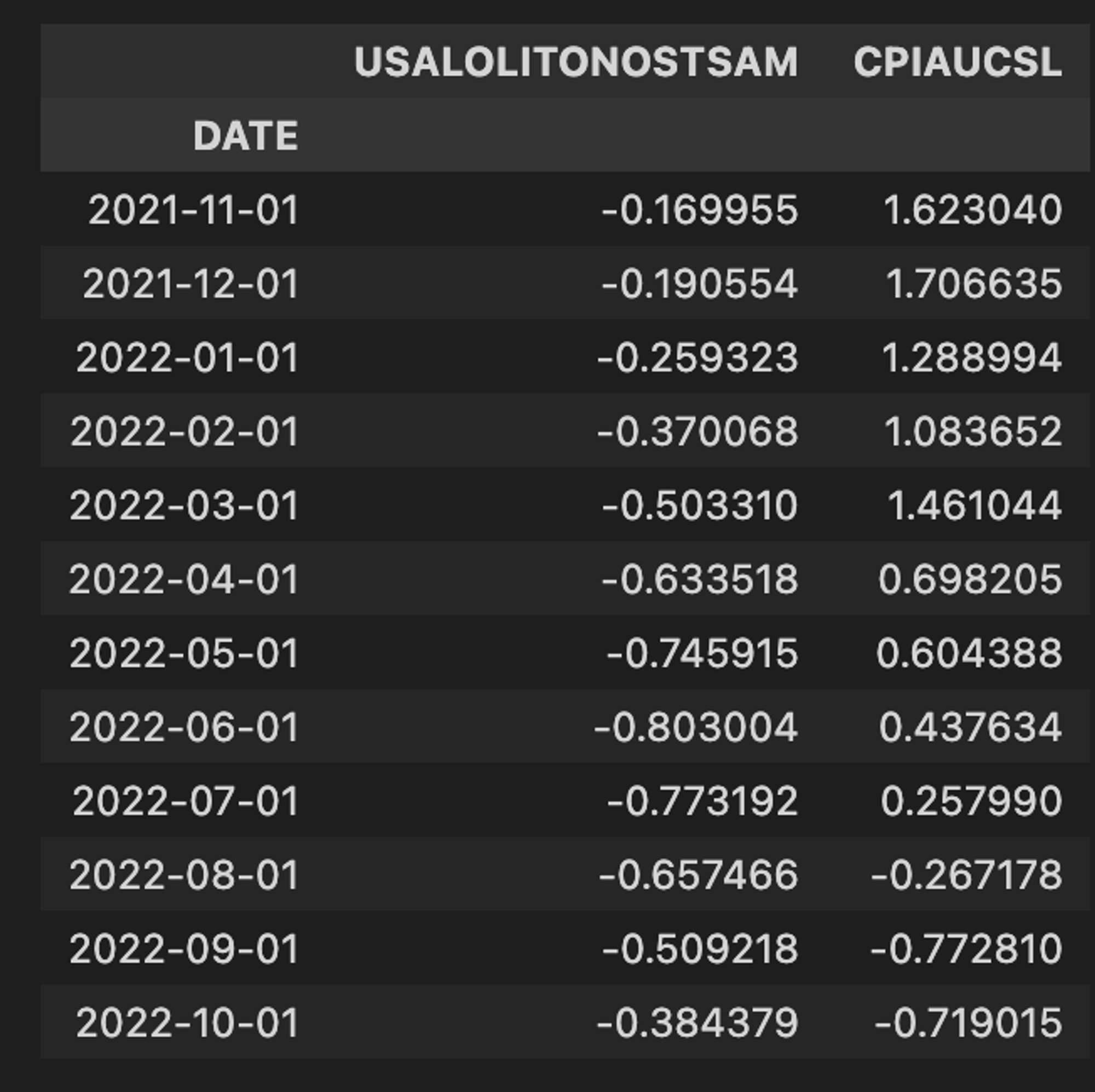
Contrasting this sample with the year-over-year sample above, we can see why using the second derivative and focusing on acceleration and deceleration matters so much.
We all know inflation has been the big bugaboo over the last year. Looking at our 3-month difference in the YoY value, we can clearly see that inflation has been decelerating for a few months now, despite the level remaining high. If we just looked at the YoY series, as most pundits and macro tourists do, we wouldn’t have picked up a meaningful reduction in the inflation rate until October.
We could spill more digital ink on this, but again, markets are forward looking and discount the acceleration and deceleration of economic data, not the levels. (From a statistician’s perspective too, differencing data increases the signal and validity by ensuring stationarity.)
In this next block, we define our four economic regimes based on the map above using a few nested
np.where statements.gi3.loc[:, "Regime"] = np.where( (gi3["USALOLITONOSTSAM"] > 0) & (gi3["CPIAUCSL"] <= 0), 1, np.where( (gi3["USALOLITONOSTSAM"] > 0) & (gi3["CPIAUCSL"] > 0), 2, np.where((gi3["USALOLITONOSTSAM"] <= 0) & (gi3["CPIAUCSL"] > 0), 3, 4), ), ) gi3.loc[:, "Label - Q"] = gi3.index.to_period("Q").astype(str) gi3.loc[:, "Label - M"] = gi3.index.strftime("%b '%y") gi3.resample("M").last()
Labeling the regimes numerically makes the initial mapping clean and succinct, but doesn’t tell us much about what each regime represents. Let’s be more descriptive.
labels = {1:'moon', 2:'still gucci', 3:"it's fine. we're fine.", 4:"lol rekt."}
er.loc[:,'Regime'] = er['Regime'].map(labels)
We can wrap all of our work to this point into a function for easy reuse. Now we can import this function as needed to effortlessly add context of economic regime to whatever we might want to study (asset prices in this case).
def econRegime():
    cli = "USALOLITONOSTSAM"
    cpi = "CPIAUCSL"

    g = pdr.DataReader(cli, "fred", "1900-01-01")
    i = pdr.DataReader(cpi, "fred", "1900-01-01")
    i = i.pct_change(12) * 100

    gi = pd.concat([g, i], axis=1).dropna()
    gi3 = gi - gi.shift(3).dropna()
    gi3.loc[:, "Regime"] = np.where(
        (gi3["USALOLITONOSTSAM"] > 0) & (gi3["CPIAUCSL"] <= 0),
        1,
        np.where(
            (gi3["USALOLITONOSTSAM"] > 0) & (gi3["CPIAUCSL"] > 0),
            2,
            np.where((gi3["USALOLITONOSTSAM"] <= 0) & (gi3["CPIAUCSL"] > 0), 3, 4),
        ),
    )
    gi3.loc[:, "Label - Q"] = gi3.index.to_period("Q").astype(str)
    gi3.loc[:, "Label - M"] = gi3.index.strftime("%b '%y")

    return gi3.resample("M").last()
Step II: Historical Asset Returns by Regime
We’re going to pick up this part assuming we already have some historical data in place, preferably total returns but price data is fine. Posts on retrieving historical data and calculating total return can be found here and here, respectively. We’ll also assume that the regime time series generated above is available.
We are going to add two imports that will help us quantify the statistical significance (or lack thereof) in the variation of an asset’s historical performance across different economic regimes.
from scipy.stats import ttest_ind
from itertools import combinations
Here, through a clean chain of pandas methods, we’ll calculate the rolling 30 day total return of an asset, and resample to get and end of month value that will line up with our
econRegime .ticker = "SPY" mr = ( trs[ticker] .rolling(window=30) .apply(lambda x: np.prod(1 + x) - 1) .resample("M") .last() .dropna() )
mr_er = pd.concat([mr, er["Regime"]], axis=1).dropna()
We can then take advantage of the pandas
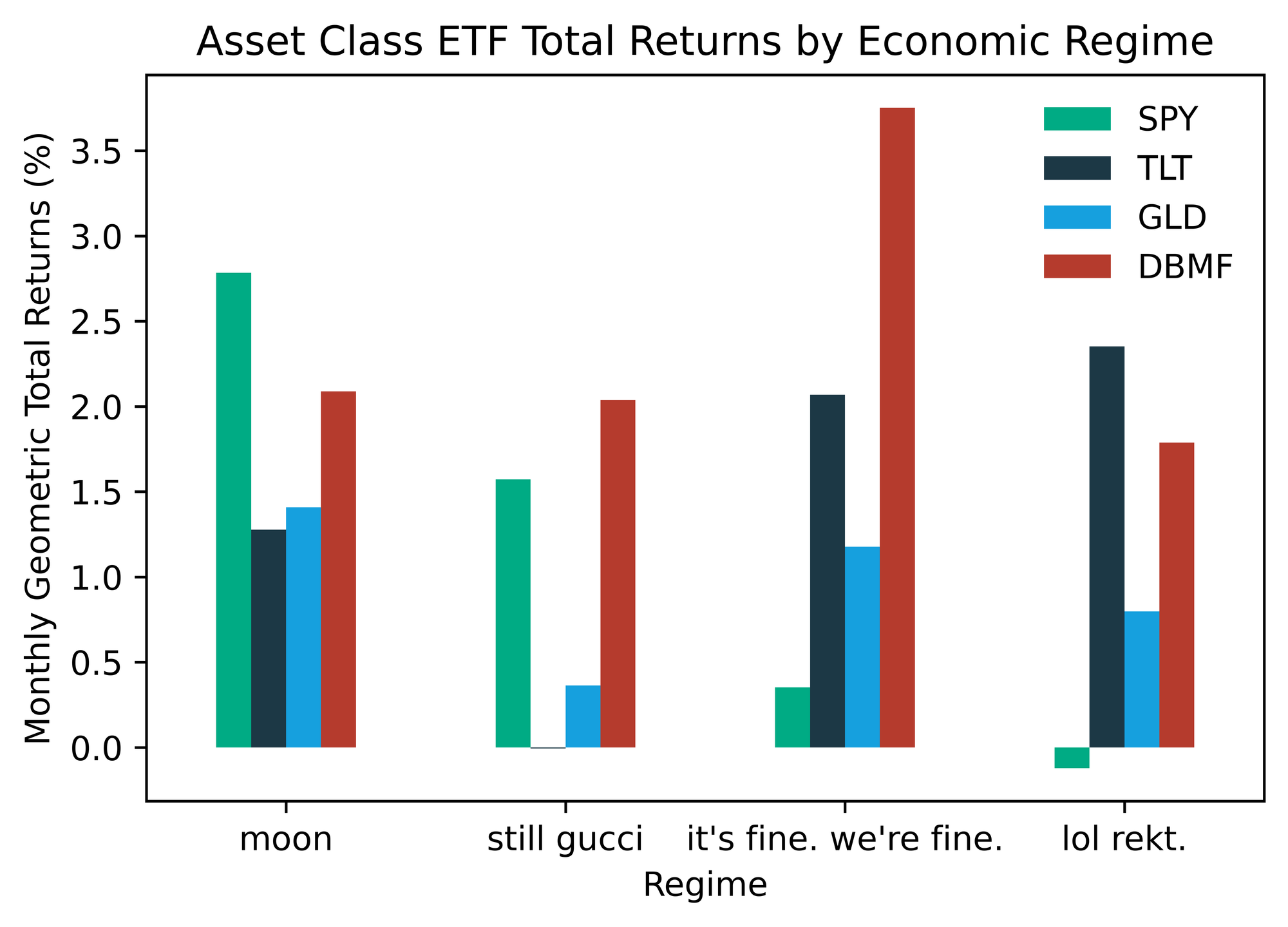
groupby functionality to easily aggregate summary statistics (sample size, arithmetic average return, geometric average return, and standard deviation) for our test asset across all four regimes. The S&P 500 ETF (SPY) is a great test asset, because you can clearly see that each regime has its own distinct fingerprint as it relates to performance be volatility.
regime_stats = pd.concat(
    [
        mr_er.groupby("Regime").size().rename("Months of History"),
        mr_er.groupby("Regime").mean().rename(columns={ticker: "Arithmetic Return"}),
        mr_er.groupby("Regime").std().rename(columns={ticker: "Standard Deviation"}),
    ],
    axis=1,
)
regime_stats.loc[:, "Geometric Return"] = (
    regime_stats["Arithmetic Return"] - regime_stats["Standard Deviation"] ** 2 / 2
)
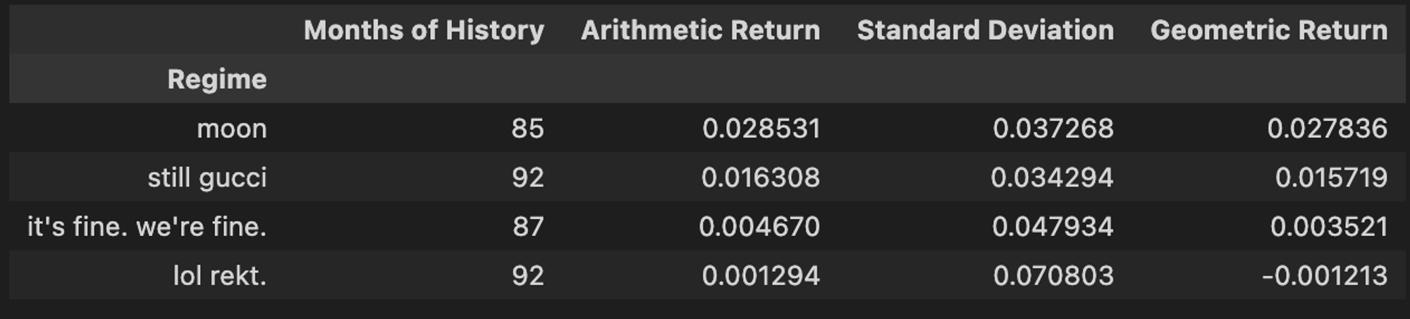
We can see a clear difference in the historical risk/return profiles of each regime. Makes sense… If we peek under the hood of the
rekt regime, we see an absolute Murderer’s Row of recessions.Why are we calculating the geometric average of monthly returns in each regime as opposed to just simple/arithmetic? To speak plainly, the geometric average incorporates the impact of volatility on compounding through time. My favorite way to think about it: the geometric mean represents one person going to a casino and playing 100 consecutive hands, while the arithmetic mean represents 100 people going to the casino and playing one hand. This is an impossibly deep rabbit hole. Here is a fantastic blog if you’re looking to take the plunge.
Obviously SPY has only been around since 1993, so our sample size is limited. More full history for US equities can be found at the websites of Robert Schiller or Kenneth French, as well as Yahoo Finance. French’s data library also contains a historical return data for a number of systematic factors (eg. Size, Value, Momentum, Quality) and would make natural extensions for this work.
For now though, let’s bundle and generalize the process we went through above to make it easier to scale our analysis to other assets.
def get_regime_stats(monthly_returns, economic_regimes):
    mr_er = pd.concat([monthly_returns, economic_regimes], axis=1).dropna()
    regime_stats = pd.concat(
        [
            mr_er.groupby("Regime").size().rename("Months of History"),
            mr_er.groupby("Regime").mean().rename(columns={monthly_returns.name: "Arithmetic Return"}),
            mr_er.groupby("Regime").std().rename(columns={monthly_returns.name: "Standard Deviation"}),
        ],
            axis=1,
    )
    regime_stats.loc[:, "Geometric Return"] = (
        regime_stats["Arithmetic Return"] - regime_stats["Standard Deviation"] ** 2 / 2
    )
    return regime_stats
Let’s run it back with our function on something more volatile, like bitcoin…
get_regime_stats(btc_monthly_ret, er["Regime"])
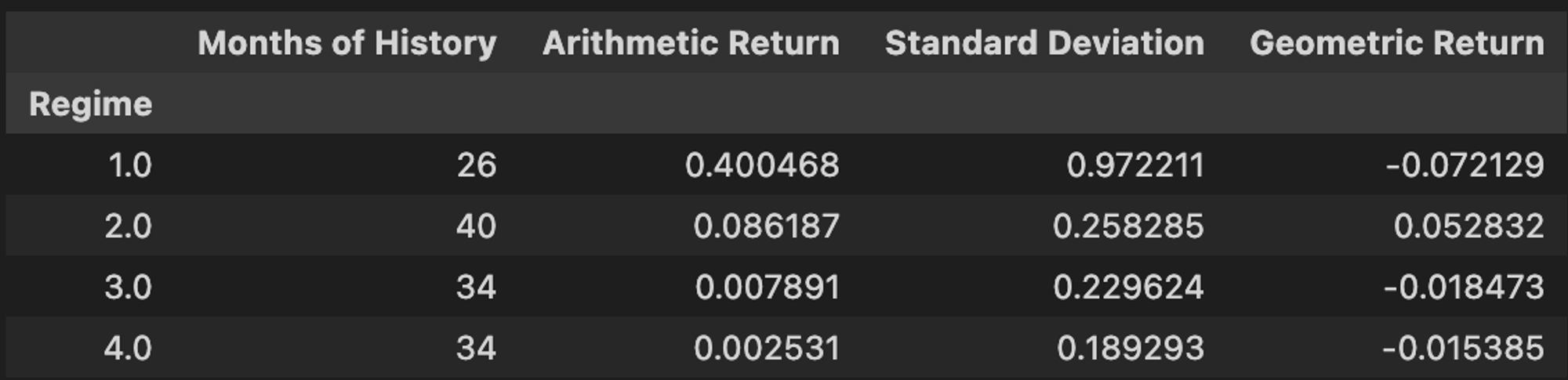
Look at that volatility. If SPY is a strong cup of coffee, the orange coin is a key bump of Pablo’s finest.
Obviously, our sample sizes are much more limited here, especially in the (📈,📈) regime. This raises an important question, are these variations in performance across regimes statistically significant, or random noise? I’m glad we asked!
Let’s take our monthly SPY (S&P 500 ETF) returns for each regime and and see if we can claim the performance in one regime was truly different than another with any degree of statistical significance. It makes narrative sense why one regime should outperform another, but was there really any difference between
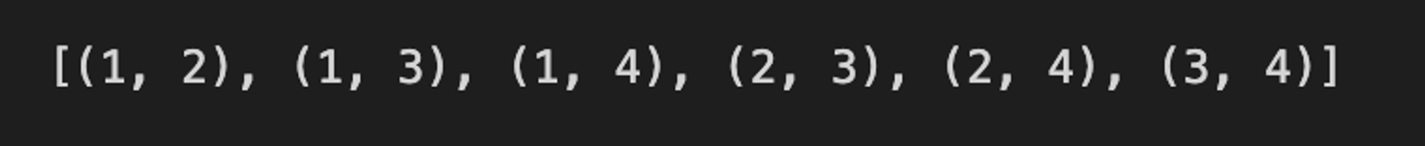
moon and rekt in the eyes of the stats gods? To find out, we are going use Welch’s Two-sample T-test with unequal variance. To do that, we’ll first need a list of all possible regime combinations. Luckily, python comes with a function in the
itertools package built to do exactly that, combinations. The function takes two arguments, a list of items (our regimes), and the size of each unique combination (2). It returns a list of tuples containing all unique combinations of items passed.
regime_combos = [item for item in combinations([1, 2, 3, 4], r=2)]
We can now take this list and iteratively apply the TsTt to each regime pair by passing both sets of returns to the
scipy.ttest_ind function. We set equal_var=False because the sample sizes are not the same as economic regimes prevail with differing frequencies. The last two lines in the code block extract the test statistic and p-value for each regime pair and package it in an easily digestible form.
tt = {
    rc: ttest_ind(
        mgr_er[mgr_er["Regime"] == rc[0]],
        mgr_er[mgr_er["Regime"] == rc[1]],
        equal_var=False,
    )
    for rc in regime_combos
}
tt = {k: {"t-stat": v[0][0], "p-value": v[1][0]} for k, v in tt.items()}
tt_df = pd.DataFrame(tt).rename(columns=labels)
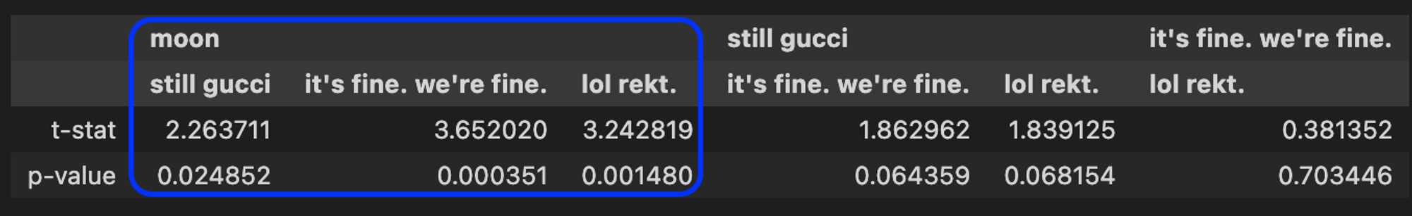
As we can see, since SPY’s inception in 1993, the average returns in the
moon regime did differ from all others at a 97.5% or higher confidence level. Thus, we can conclude that there is some signal in the average returns between those regimes, which can inform our expectations of the probabilistic paths for asset returns in future environments. When we are looking at different assets to evaluate for in the Permanent Portfolio context, it’s helpful to have these statistical tests handy to see how reliable the data might be for different assets, especially for newer products where history is limited.
Does this mean that the spoos will always outperform in that regime relative to the others in the future? Maybe, but maybe not! Which leads to some concluding thoughts…
How does this all relate to the Permanent Portfolio?
The premise here is that as investors we ought to think about the future with some humility — we truly have no idea what is going to happen. Markets are non-stationary and non-ergodtic.
However, by selecting assets that have shown propensity to perform across varying economic regimes, we can reduce our risk of ruin through diversification and compound wealth over the long run.
Happy tinkering,
murph
p.s. I am not active on social media. If you’d like to be notified of new tutorials when they drop, consider hopping on my mailing list.