Perhaps the most direct and high profile impact of the surge in interest rates over the last year is the cratering of housing affordability. US consumers can afford 40% less house than they could a year ago for the same mortgage payment.
Today we’ll learn how to quantify this phenomenon using freely available FRED data to calculate how much house someone can afford holding their mortgage payment as a constant percentage of income. Know-it-all with confidence at your next happy hour!
Finance Topics Covered
- The impact of mortgage rates on housing affordability.
Technical Skills Used
- pandas, pandas datareader
- numpy, numpy financial
- matplotlib
Let’s Get to the Code
As per usual, we’ll start by installing a couple of packages via the command line. Pandas DataReader is a wrapper for seamlessly accessing more than a dozen apis. Numpy financial is a spinoff of numpy — about three years ago the numpy maintainers decided to deprecate the basic financial functions, so they carved them out into a standalone package. Matplotlib is the OG python plotting package. In future posts and projects, we’ll explore more dynamic and interactive plotting solutions, like plotly.
pip install pandas-datareader
pip install numpy-financial
pip install matplotlib
Next… you guessed it, we import.
import pandas_datareader as pdr
import pandas as pd
import numpy_financial as npf
import matplotlib.pyplot as plt
We’ll need a few pieces of data:
- 30-year mortgage rate (FRED id:
MORTGAGE30US)
- Real Median Household Income (FRED id:
MEHOINUSA672N)
- Real Disposable Personal Income per Capita (FRED id:
A229RX0)
A couple of things to note. First, we’re using “real” measurements to control for the effects of inflation. Second, we’re going to take a look at two different measurements of income. One is updated annually, the other monthly, but the real benefit is simply to add some robustness and demonstrate that the same relationship holds.
The beauty of pandas datareader is that we can pull all three in the same api call. We’ll add the forward fill (
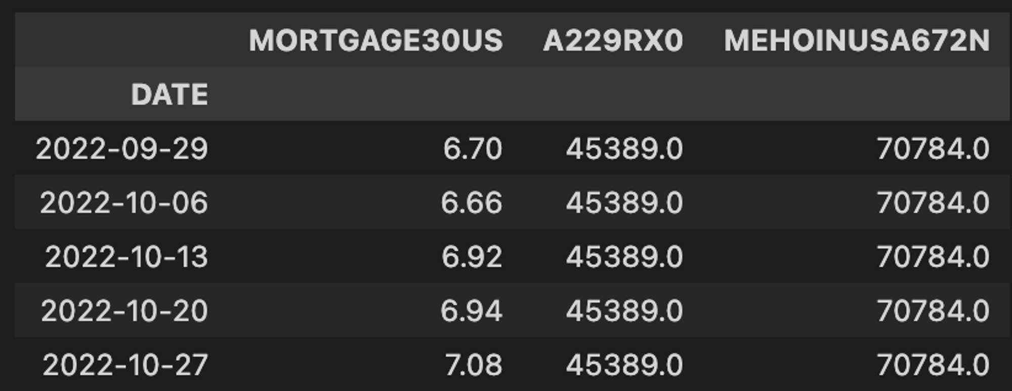
.ffill()) method on the end to use our annual and monthly frequency income with our weekly mortgage rates. As we’ll see, home/mortgage affordability volatility experiences drastic swings because interest rates change on a daily basis, while our incomes typically only change on an annual basis.df = pdr.get_data_fred(['MORTGAGE30US', 'A229RX0','MEHOINUSA672N'], '1900-01-01').ffill() df.tail()
For grins, lets plot the 30-year mortgage rate to put some historical context around the speed and magnitude of the latest surge.
fig, ax1 = plt.subplots()
df['MORTGAGE30US'].plot(ax=ax1, color='#16A0DE')
ax1.set(
    xlabel='',
    ylabel='Interest Rate (%)',
    title='US 30 Year Mortgage Rate\n1970-Present'
)
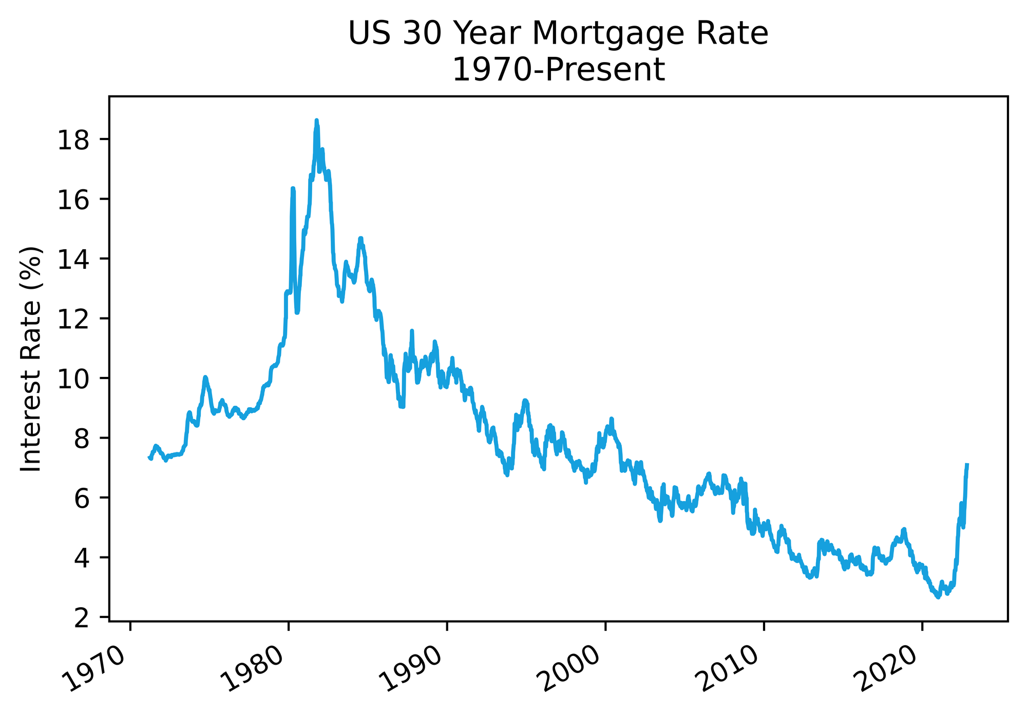
As we can see in the figure below, we’ve gone from all-time lows to 20-year highs in the last eighteen months… oof.
Next, we’ll set our
housing_spend factor and use that in conjunction with some chained pandas dataframe methods to arrive at a monthly mortgage payment that is a constant percentage of income over time (in this example 30%).housing_spend = 0.3 df.loc[:,'mort_pmt_med'] = df['MEHOINUSA672N'].divide(12).multiply(housing_spend) df.loc[:,'mort_pmt_dpi'] = df['A229RX0'].divide(12).multiply(housing_spend)
Now for the fancy bit. We’re going to use the present value function from the numpy financial package to back into a mortgage size for each rate and monthly payment combination. Basically we are asking, for a given interest rate and payment amount, how much house one could finance.
Since numpy (and numpy financial by extension) is designed to perform vectorized operations, we can pass entire columns as arguments. Specifically, the first argument is our 30-year mortgage rate converted to decimal and divided to by twelve to reflect monthly payments, the second is the number of payments over the life of the mortgage (12 monthly payments * 30 years = 360 payments), and third is the monthly payment amount based off of our two income measures. We run this as a lambda function inside of an apply to assign new columns to our dataframe.
df.loc[:,'pv_med'] = df.apply(
		lambda x: npf.pv(x.MORTGAGE30US / 100 / 12, 360, x.mort_pmt_med * -1),
		axis=1 #               1                     2           3
)
df.loc[:,'pv_dpi'] = df.apply(
		lambda x: npf.pv(x.MORTGAGE30US / 100 / 12, 360, x.mort_pmt_dpi * -1),
		axis=1
)
We can also express the dollar amounts above as multiples of income:
df.loc[:,'pv_income_med'] = df['pv_med'] / df['MEHOINUSA672N']
df.loc[:,'pv_income_dpi'] = df['pv_dpi'] / df['A229RX0']
Let’s come up for air and run
df.tail() to see what we’re working with.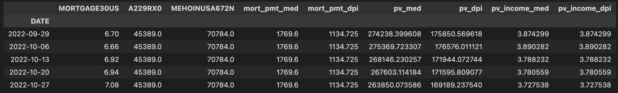
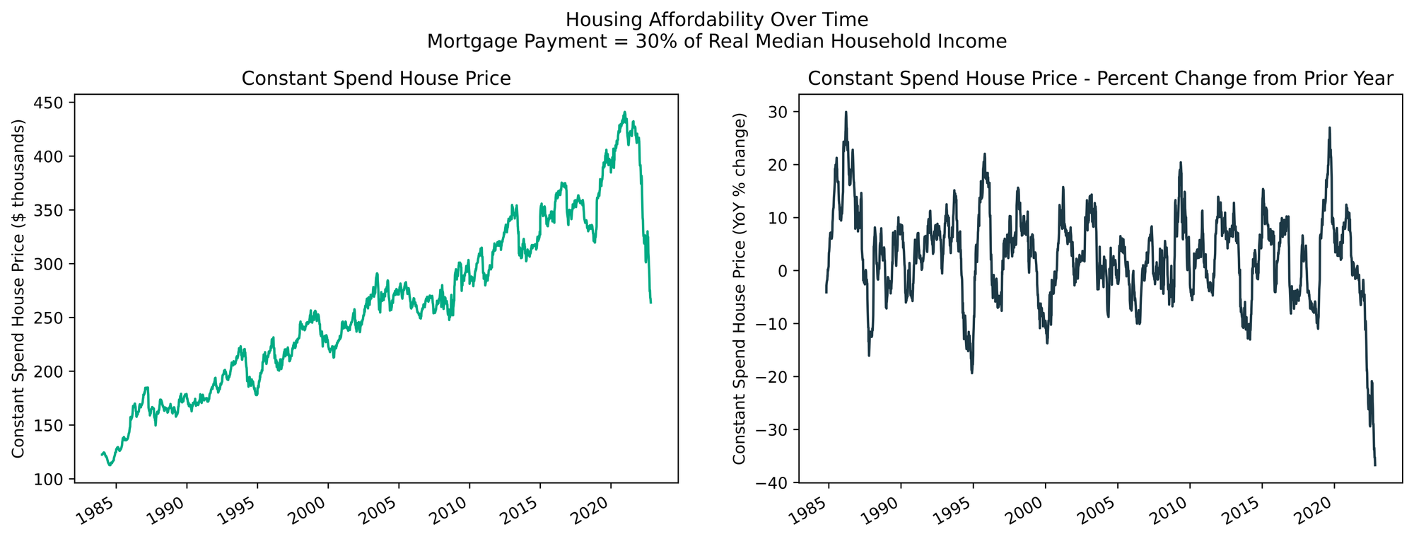
Finally, let’s utilize matplotlib to visualize the absolute and relative changes in mortgage size/home price affordability over time. This code block generates the figure at the top of the post.
fig, (ax1, ax2) = plt.subplots(1, 2, figsize=(15,5), facecolor='white')

df['pv_med'].divide(1000).plot(ax=ax1, color='#00AB84')
ax1.set(
    xlabel='', ylabel=f'Constant Spend House Price ($ thousands)',
    title='Constant Spend House Price'
)

df['pv_med'].pct_change(52).multiply(100).plot(ax=ax2, color='#1C3845')
ax2.set(
    xlabel='', ylabel='Constant Spend House Price (YoY % change)',
    title='Constant Spend House Price - Percent Change from Prior Year'
)

plt.suptitle(f"Housing Affordability Over Time\nMortgage Payment = {int(housing_spend * 100)}% of Real Median Household Income", y=1.025)
fig.savefig('affordability.svg', transparent=True, bbox_inches='tight')
By changing the column referenced in the plot call from
pv_med to pv_dpi and tweaking the title, we can easily replicate the chart from the top with Real Disposable Personal Income per Capita. We see that the results are slightly different, most notably in the price chart on the left, as its a per capita and not household level income estimate. But, we are left with the same conclusion: housing affordability is down 40% from the prior year, the biggest contraction in consumer financing power since this dataset began in 1970.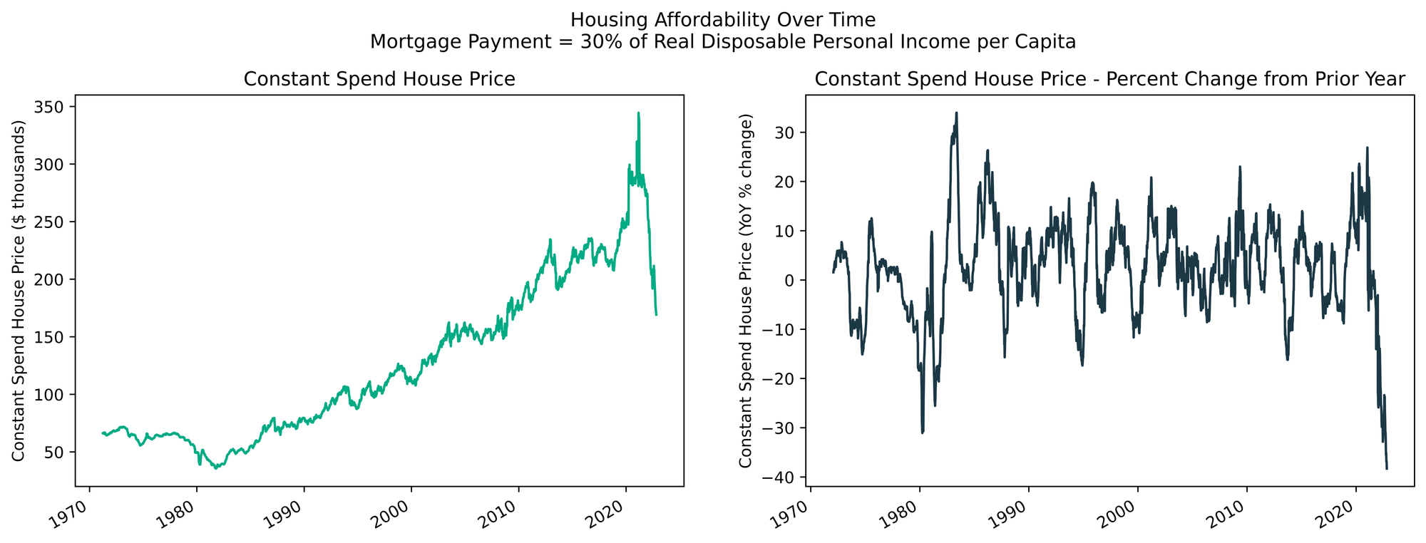
Let’s be extra — recession bars
In our quest to be extra, we’re going to add another plot to our year-over-year chart to put our housing affordability metric in the context of US recessions. Let’s make another quick call to FRED.
rec = pdr.get_data_fred('USRECM', '1900-01-01').truncate(before=df['pv_dpi'].dropna().index[0])
We can end that call by passing the date of the first income data point () to the truncate method, so we keep only the recession data we need (the full data set goes back to 1860!). The output is just a binary flag, 1 during recessionary periods (as defined by the NBER), and 0 otherwise.
Finally, we plot the recession data on the same x-axis before our existing line plot so it appears in the background, and then clean things up by removing the second y-axis and changing the label in the legend.
fig, ax1 = plt.subplots(figsize=(9,5), facecolor='white')

ax2 = ax1.twinx()
rec.plot(ax=ax2, kind='area', color=COLORS[4], alpha=0.2)
ax2.get_yaxis().set_visible(False)
ax2.legend(['NBER US Recession'], frameon=False, bbox_to_anchor=(0.65, -0.05))
df['pv_dpi'].dropna().pct_change(52).multiply(100).plot(ax=ax1, color=COLORS[1])
ax1.set(
    xlabel='', ylabel='Constant Spend House Price (YoY % change)',
    title=f"Year-over-year Change in US Housing Affordability and Recessions"
)
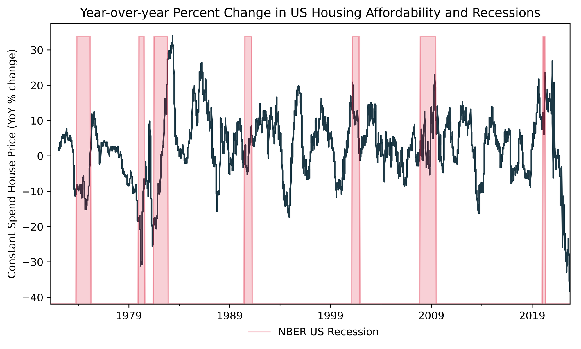
Interestingly, the 1973-74, ‘79, ‘81-82, and to a lesser extent ‘91 recessions also coincided with local low points in terms of housing affordability. These recessions all transpired during inflationary periods, which makes since because the typical monetary policy response by the Fed when faced with inflation is to hike interest rates aggressively which of course flows through into mortgage rates.
Given the inflationary backdrop and subsequent interest rate volatility, the period we are living through currently has more in common with those periods than the Tech Bubble, Global Financial Crisis, and COVID-19 recession. Early indications show that the recent surge in interest rates is beginning to destroy demand in the housing market, but that is another cheery conversation for another day!
happy tinkering!
murph
p.s. I am not active on social media. If you’d like to be notified of new tutorials when they drop, consider hopping on my mailing list.